Professional project
B2B Catalog, from Pixels to Profits
Design Challenge
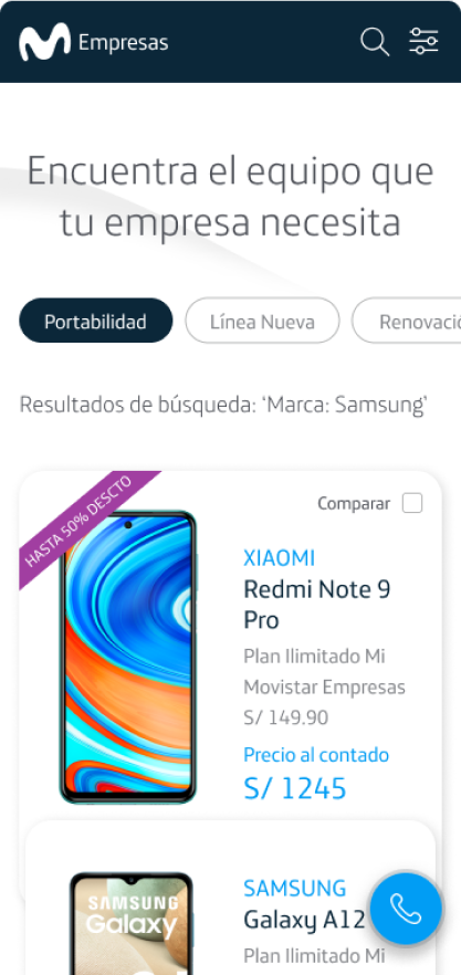
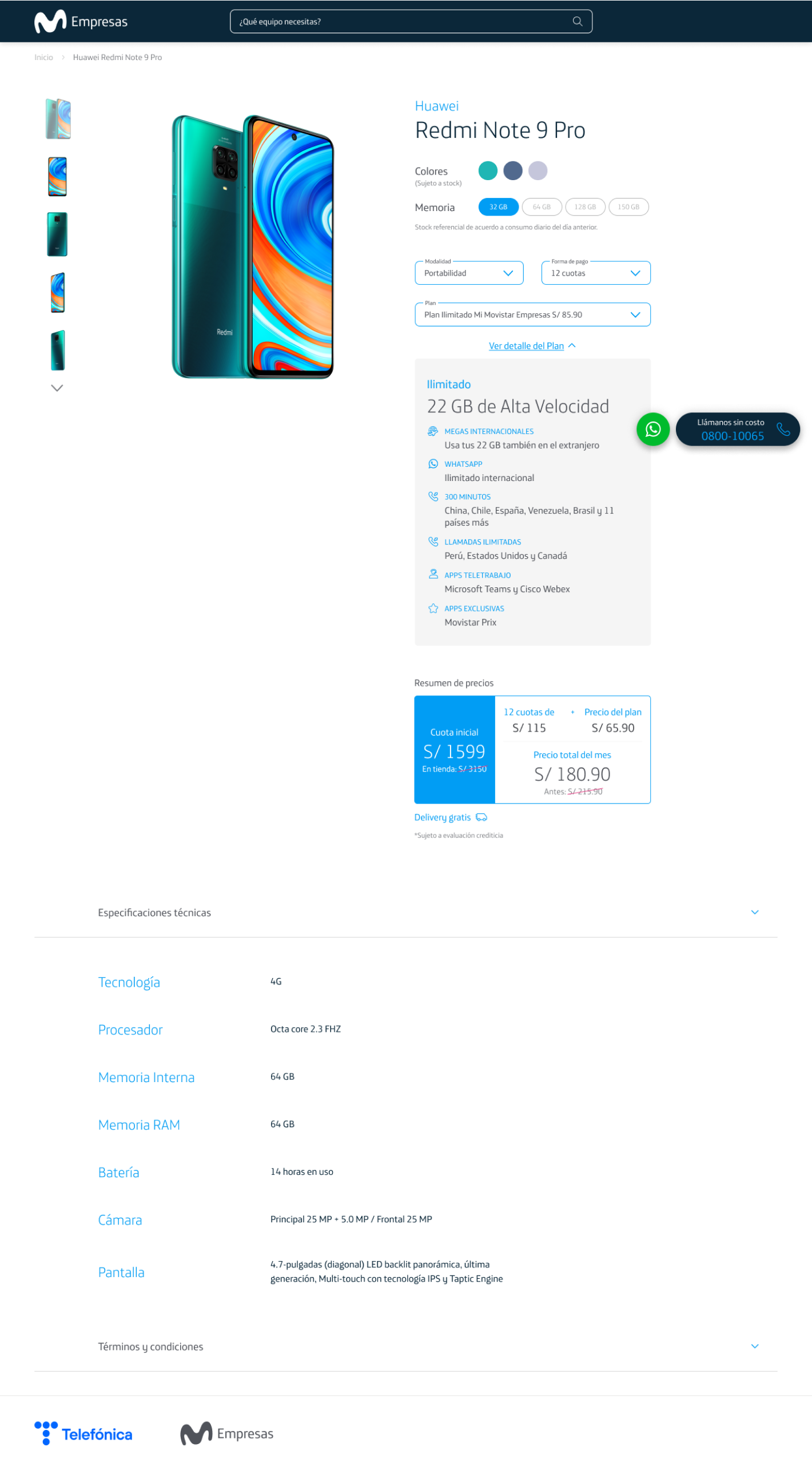
The objective of this particular project was to promote the sale of mobile devices through the digital channel nationwide, as well as to improve the quality of the leads generated (potential customers) by complementing the Tienda Online.
The catalog was developed under a mobile-first approach with great emphasis on user experience and predictable navigation (simple, concise and visual communication of the smartphones and its characteristics).
It was contemplated that this project can be managed from the back-end by Telefónica through a CMS. This project complements the Tienda Online Movistar Empresas.
Problem
Old website, no maintenance, no flexibility for current content.
Solution
Redesigned and built from scratch site managed from a back-end.
Impact
3x increase in mobile sales. Changes reflected instantly on the website.
ROLe
Product Designer Lead
Led a multi-disciplinary team of 7 (3 designers and 4 developers) producing global digital B2B products.
team
2 Products Designer
1 Front-end Developer
2 Back-end Developers
1 QA
year
2021
main learning
"Design is a catalyst for Growth"
How did we do it?
Design Thinking Double Diamond Process + SCRUM
01
Discover
Exploring the current context
Although we already had the Tienda Online Movistar Empresas, in which we could sell all B2B products (fixed, mobile and digital products). We validate the need to promote the sale of mobile devices where the user can have access to the entire catalog of smartphones and have greater capacity to personalize the offer.
This project focused on improving the digital shopping experience for mobile devices.
To understand reality we use a mixed approach: qualitative tools (in-depth interviews) and quantitative tools (Google Analytics, heatmaps - HotJar):
75%
Bounce rate
2-3%
Convertion rate
Old website page with only 18 static smartphones (no dynamic)
There was no possibility to customize the offer (modality, plan, financing)
The specs (equipment characteristics) were not displayed
High number of vanishing points (user distractions)
We analyzed the journey of end-users who were looking to buy a mobile phone during all stages from the search to the voice contract per phone call. We identify your goals, actions, emotions, touchpoints, pain points and how to translate them into opportunities (gain points).
360 Vision: Identifying the critical points
Having a total and global vision allowed us to understand that we had two clients: one internal (Telefónica) and the other external (end-user). It was not only to focus on releasing the pain points of the end-user, but also the company. We knew that solving them was going to generate a high positive impact on the entire system.
02
DEFINE
Towards a new digital shopping experience for mobile devices
After having identified the end-user and Telefónica design challenges in the research stage, we decided to ask ourselves the following question: How might we? (HMW) with the aim of stimulating creative problem solving:
How could we make the mobile shopping experience in the online channel memorable, accessible and desirable, and at the same time Telefónica can have greater autonomy and control of the websites?
After this co-creation process, we use the Product Layers tool (core, expected, augmented) to understand the features and benefits of the product that will provide better value to current and potential customers. These layers also provide the basis for product differentiation and positioning.
This matrix allowed us to prioritize and define what features (expected layer) we were going to implement in the ideation and development process. Also, establish what features could be added in the future (augmented layer).
Product Layers Catálogo Movistar Empresas
Defining Design Principles
Once the product features are defined, we define the design principles, which are considerations that form the basis of any good product. This helped us make better decisions in the ideation stage.
Inform users at all times
The user should find enough information to be able to make a purchase decision within the website.
The navigation and information architecture should be predictable.
Empathy to build trust
The user should have a more personalized search option.
Let us remember that new users do not have time, they are demanding when inquiring about what they are going to acquire and compare prices.
Focused on performance and conversion
The user should be able to generate a lead in as few steps and with as little friction as possible.
The form must be visible and request the most relevant data to generate the contact.
03
ideate
Envisioning Information Architecture (IA)
After defining the product layers and the design principles, we held workshops with current clients and non-clients of Movistar Empresas (extreme users) to devise the information structure that our product would have.
For this, we applied the cardsortting technique through Optimal Workshop, this tool allowed us to group, rank and categorize the contents so that they are understandable and recognizable by the end-user (responds to the mental model of the users). After processing the information, we define the following structure:
Setting the Catalog Userflow
Now we had to establish the path or paths that users could take to fulfill all the possible tasks that the product would allow through the Userflow. In this way, determine how different users perform tasks, in order to determine the most common paths and identify conflicting areas, reducing friction in the shopping experience.
Prototyping from low to high fidelity wireframes
As we mentioned at the beginning, the Movistar Empresas Catalog was developed from a mobile-first approach, since almost 60% of Movistar Empresas Google Analitycs sessions are through the mobile device. This means that the largest number of users who enter to search for a mobile device do so from their cell phone.
Low
Sketching
mid
Wireframing
high
Wireframing
User testings
We carry out user testing with the end-users, so that we can detect any usability difficulties in the full execution of tasks. Each user was given objectives and tasks so that they can interact with the digital product.
We performed 10 user tests and receive user's feedback
We adjusted the UX Writing in the catalog product sheet
We validated the catalog's features: filters and compare equipment
If we remember the Product Layers matrix, we prioritize 4 functionalities for the launch of this digital product:
Feature 1
Compare the mobile devices of your interest
You can compare the characteristics of the device or mobile devices that interest you the most (up to 3) without leaving the catalog.
The technical specifications that you can compare are technology, processor, internal storage, RAM, battery, camera and screen.
It is always good to make a decision with more information.
Feature 2
Search filters (customization)
The interface allows a friendly and intuitive navigation, you can quickly filter and customize the mobile device you are looking for by modality (portability, renewal or new line), plan and price.
Feature 3
Product Detail Page (personalized offer)
In the product detail page, the user can customize the modality (portability, new line or renewal), the payment method (cash or installments) and the monthly plan.
Likewise, you can see in detail the characteristics of the equipment you are looking for.
Feature 4
Buy through WhatsApp
In addition to the possibility of buying through a phone call, a sales advisor can be contacted through WhatsApp.
High Fidelity UI
For the elaboration of the wireframes on high fidelity, we worked with the Design System and the Brand Book of Telefónica, to which components were adapted. As a final result everything was compiled in Figma:
04
implement
Front-end and back-end: Bringing the design to life
Once we validated that the product complied with the appropriate web and usability standards, we began to layout. The technology used to develop the Movistar Empresas Catalog was Angular and for the CMS, Oracle Jet. The catalog is hosted on Microsoft Azure.
Back-end CMS: Instant web updates
As we saw in the initial part, every time Telefónica wanted to make changes to the website (new prices and new equipment) there was a long delay on the part of the agencies of approximately 1 or 2 weeks. This translated into dissatisfied and fruitful customers, a bad digital experience, since they saw a discontinued offer.
For this reason, we decided to make the catalog fully manageable through a CMS where anyone can change prices, plans, banners, terms and conditions with just one click and the changes are reflected instantly.
Data upload through a .csv
95% of the catalog is manageable from the CMS
Changes and updates are reflected instantly
05
launching
Growth: Paid Ads + Emailing
After 4 and a half months of hard work, we were able to launch the Movistar Companies Catalog. To do this, we used a mixed marketing strategy: organic (emailing, Movistar Empresas LinkedIn fanpage) & social paid media (Google Ads, Facebook Ads) where our goal was to create awareness in users while obtaining qualified leads.
To achieve this, on the paid side we used an open segmentation, since it was a new product and nobody had it in mind. On the Google Ads side, we use Search (list of B2B keywords for Movistar Companies) and Discovery. In Facebook Ads, we use the LDA (Lead Ad) and PPL (Page Post Link) format to drive paid traffic to the catalog.
Impact: Design is a catalyst for growth
"Design is a catalyst for growth"
41%
Bounce rate
10%
Convertion
rate
Catalog with capacity for up to 60 devices
Compare up to 3 mobile devices at the same time (characteristics of the teams)
Product detail page: possibility of customizing the offer (modality, plan, financing)
Changes and updates of the commercial offer are reflected instantly
Catálogo Movistar Empresas